
A San Francisco institution founded in 1860
Long story short
The Olympic Club was an organization steeped in history and traditions. It prided in its exclusive membership and lineage of notable athletes for multiple generations in San Francisco. Designing for a legacy driven branding was a delicate dance in politics and historical understanding.
Within 2 weeks of starting, the entire Communication Department dissolved- including the director. I saw the fallout as a golden opportunity. I remained as the sole designer and interim art director. Not only did I keep the department running with significantly less help but even pushed design standards until a new department head was found.

July issue photoset
Keep the lights on, please
The immediate challenge was to keep the department running as normal with 75% fewer resources. A temporary team assembled to continue fulfilling the stream of design requests. I ascended as the creative head out of necessity. I quickly grew into the responsibilities of overseeing communications, completing design asks and stewarding new creative vision. One of the harder personal lessons It was communicating well-defined boundaries. There was no room for flex as we were running on a much leaner team. I learned the importance of “no” and standing by it.
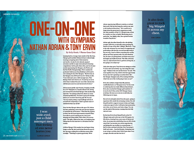
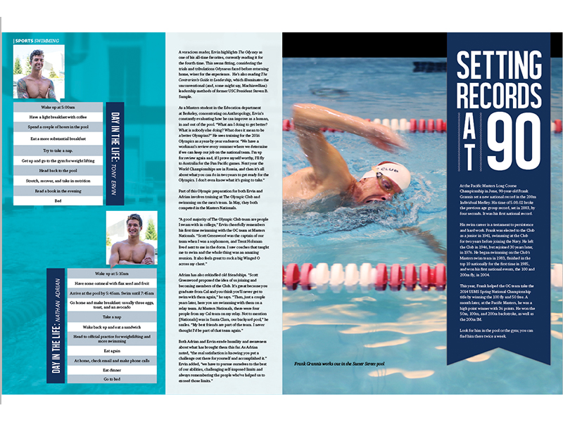
The biggest and most complex design request was publishing the monthly “The Olympian”. It was a 30+ page, physically published magazine every club member looked forward to receiving. “The Olympian” was the face of The Olympic Club. The magazine consisted of a cover story featuring an outstanding athlete, sport interviews, competition updates, past socials, upcoming fundraisers and summed up with sponsors.
“The Olympian” was a combined effort of all the sport departments, trainers and event planners at the club. As the sole designer, I communicated with every submission and touched every page.

July issue photoset

July issue photoset

The cover story was the most anticipated part of the magazine. Anyone who quickly thumbed through the publication immediately flipped to the cover story. The Olympic Club prided itself in being a sports club first and foremost, so I approached the imagery with the standards of a sports magazine.
Sports magazines operated at a higher caliber of visual imagery and creativity than the previous team established with “The Olympian”. I saw it as a chance to set a new benchmark and invite some playfulness to the monthly cover story.
Pictured in the July issue I pitched (pun intended) the idea of having the chosen baseball player hit water balloons for the photoshoot. I worked with a photographer to setup lighting and capture the perfect shot. I then processed the photo myself for it to be cover worthy.

Why not raise the creative standards?
As the sole creative lead, I took the opportunity to push the design bar. Although the Olympic Club did not liken itself like a design agency, I saw ample opportunity for the organization to take itself more seriously design-wise. At the time, the club was struggling with recruiting new, younger members. A huge reason for the club’s low recruitment members was its hesitancy towards change and inclusion to the growing diversity the Bay Area now composed of.
“The Olympian” reflected the same steadfast, unchanged values. By pushing the imagery and topic matter in the publication, it could make an incremental step in reflecting the values of the younger club members and ultimately the genetic makeup of today’s San Francisco.

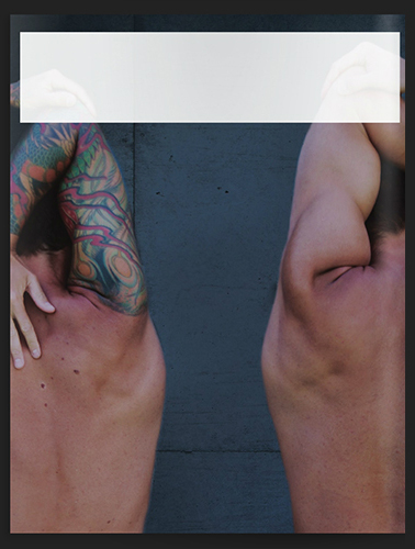
The August issue stirred up a lot of controversy
because it featured an Olympian swimmer with a full sleeve tattoo.
To me it was natural for a successful, US Olympian swimmer to be showcased in swimwear with his torso exposed. However, it was very taboo for the Olympic Club. The stance on tattoos was looked down upon by the legacy members. Many of the administrative staff and board members were apprehensive (rightly so!) about the response of longtime club members.
The August issue underwent additional reviews, proofing and approvals before being published. Luckily I received the support of the General Manager and Club Membership staff to continue advocating the designs.
Right before the hard copies arrived in each club member’s mailbox, we debriefed multiple departments of the possible negative backlash. It was important each staff member from the billing department to waiter in the club restaurant be prepared appropriately.
More select samples from various magazine issues:
And was it a complete disaster?
The reaction received the expected negative backlash but not to the magnitude that was feared. In fact, it was met with positivity. Club members and on-site staff who identified strongly with body art expressed how for the first time they felt included and welcomed. A club member shared how he felt more comfortable exposing his tattoo during workouts and walking on club grounds instead of constantly covering it. An onsite cook from the club restaurant surfaced a similar feeling.
Learnings
Pushing the envelope tactfully
Setting new design standards was tough. It was tougher still when the organization had no aspirations to do so. At Olympic Club I learned how to navigate complex political landscape. It was imperative to not only have the on-site staff support but board members as well. Luckily I solicited the advice and help of influential administrative staff. In hindsight I realized how incredibly strategic these individuals were in pushing the new designs. The experience gave me new perspective how to respect and navigate well-established work structures.
Design can be a refuge
The most surprising outcome of pushing the status quo was the positive affirmation. Initially I set out only to hit higher design standards. Changing the magazine cover offered refuge for persons who related to the full sleeved Olympian swimmer. It was amazing to see how deeply some club members connect with the new imagery.